

The S&P 500 outperforms most active funds for a structural reason most investors never consider: it’s market-cap weighted, so winners automatically grow their share of the index and losers shrink out. The index self-corrects continuously without fees or emotion. That mechanism is why long-term returns have been so strong, and why it is worth owning.
Most people think of the S&P 500 as a stable basket of America’s 500 biggest companies, something that just sits there while the market moves around it. That’s not quite right.
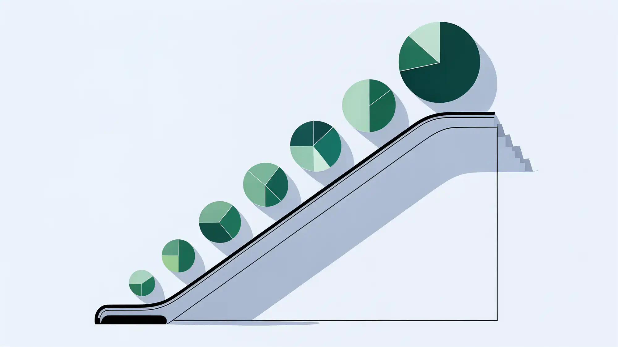
The index is market-cap weighted, which means every company’s share of the index is proportional to its total market value. When a company grows, it automatically becomes a bigger piece of your portfolio. When it shrinks, it takes up less. You don’t have to do anything; the mechanics do the work. When a company declines badly enough to fall out of the top 500, the selection committee removes it and replaces it with a company that has grown into eligibility. The index is constantly being upgraded.
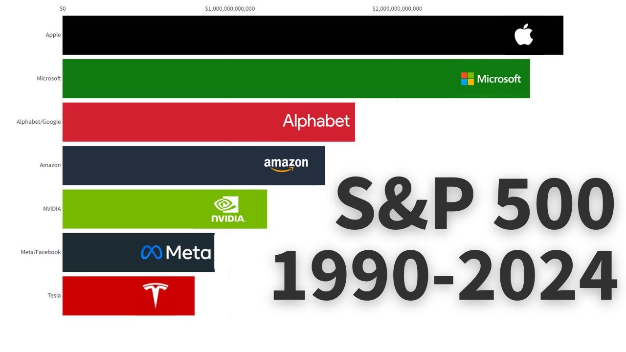
Tesla is the clearest recent example. It wasn’t in the index at all in 2017, then entered in late 2020 and quickly became a top-10 holding as its market cap surged. Meanwhile, companies like General Electric, once America’s most valuable, have been reduced to minor positions or removed entirely as they declined.
This structure is a significant reason the S&P 500 has outperformed most actively managed funds over long periods. Fund managers charge fees to do what the index does automatically: concentrate exposure in winners and reduce it in losers. The index just does it cheaper, around the clock, without human error. A low-cost S&P 500 index fund or ETF (many charge 0.05% or less annually) gives you access to this system for almost nothing.
The practical move is straightforward: buy a low-cost S&P 500 index fund, keep buying through market dips, and let the index’s built-in mechanics work over time. You’re not betting on 500 companies staying great forever. You’re betting that the system will keep replacing the ones that don’t.
Want to see it in action? This bar chart race shows the top S&P 500 companies by market cap rising and falling over three decades, and makes the churn very concrete.

Editorial & Advertiser Disclosure: The editorial content on this page is not provided, commissioned, reviewed, approved, or otherwise endorsed by any advertiser. Opinions expressed here are ours alone, not those of any advertiser. The offers that appear on this site are from companies that compensate us. That compensation may influence which products we cover and where and how they appear on a page – including the order in which they appear – but it does not influence our evaluations, ratings, or opinions. We do not include every company or offer available in the marketplace.
Related: